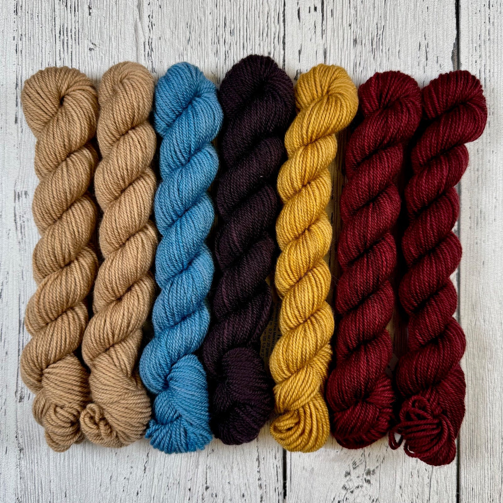
One of the best treats as the master dyer for Ancient Arts happens twice a year…and what is that, you might ask? Why, I get to build a collection of new colourways! All of us at Ancient Arts feel that it’s important to keep our colour collections fresh and current – so twice each year, we review our current colours, retiring any which no longer fit with what knitters want and need, and then the real fun begins!
This process begins with choosing a theme and overarching concept (for instance, folk art or nostalgia) that will guide the next series of colours, and then tie this in with the Pantone fashion forecast for the coming season. These forecasts are a very fun and useful tool which helps predict what colours will be important to knitters, crocheters, and weavers in the upcoming seasons. A new colour collection is usually somewhere between 10-15 colours, but may have even more if inspiration really hits (or I have more time).
Without further ado, let me introduce our Spring/Summer 2016 lineup of new colours! The theme for this collection builds on last year’s, where we explored a sense of nostalgia. Once more, we look to the past, and use a lens of fun and happiness to develop this year’s collection drawing on several decades from the last century, including the twenties, fifties, seventies, and of course, the eighties! Today’s post will cover the main colour line up, and in our next post we will explore the new Meow and Woof additions, as well as our fabulous new limited edition Denim Collection!
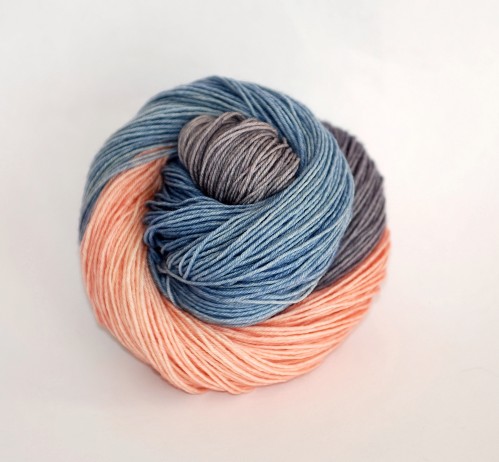
First, we start with Art Deco. This colour is influenced by the elegant art, architecture, and dress of the 1920’s and incorporates the 2016 Pantone colour of the year, Rose Quartz and Serenity. Dyed in 1/3rds this colourway lets the 2016 colour of the year play with a coordinating colour called Roaring Twenties. Art Deco is lovely when paired with its matches consisting of Kitten Nose Pink, Tranquility, and Roaring Twenties.
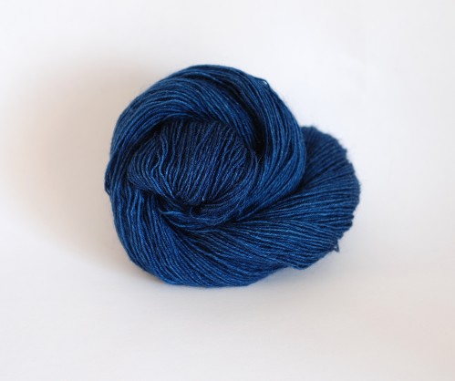
Lookin’ Fine in My New Blue Jeans is a lovely deep rich blue based on of course that iconic and trendy fashion item denim! A new pair of gorgeous blue jeans is always a pleasure to wear with its rich intense colour and I have had the BEST adventures when wearing my favorite jeans. From visiting Paris to hiking some of the best trails in the world, they take me everywhere. For me, blue jeans are a signature garment; the current denim trend in the fashion world makes me excited to offer a colourway that captures their feel.
Electric Sheep is a fun and brilliant take on green. In general, green is a peaceful and happy colour and makes me think of nature, the great outdoors, and my childhood. Electric sheep is a vivid green reminiscent of the bright colours from the 70s. Why electric sheep? Think wool and the outdoors… add in getting all excited about knitting, put that energy in the intensity of the colour – it really is electrifying!
Peachy Keen is another colour inspired by the 70s. My mother was an amazing seamstress and one year she made me the most fantastic pair of orange satin bell bottom pants you have ever seen. I wore them with great pride (I was eight and it was the seventies – it wasn’t my fault!). Alas, only another child of the 70s can truly appreciate them for what they were, but I have immortalized those pants and their fantastically bright shade of colour in Peachy Keen!
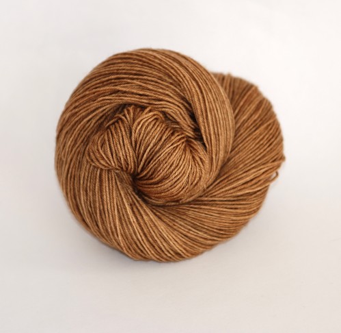
Iced Coffee is a rich hue inspired by its namesake – it makes me think of lovely summer hours spent relaxing in the shade outside my favorite beverage place. This colour pairs wonderfully with Lookin’ Fine in My New Blue Jeans and is fabulous when used in a asymmetric vest with fringe and worn with your best pair of jeans. So 80’s and yet so fabulously updated and current!
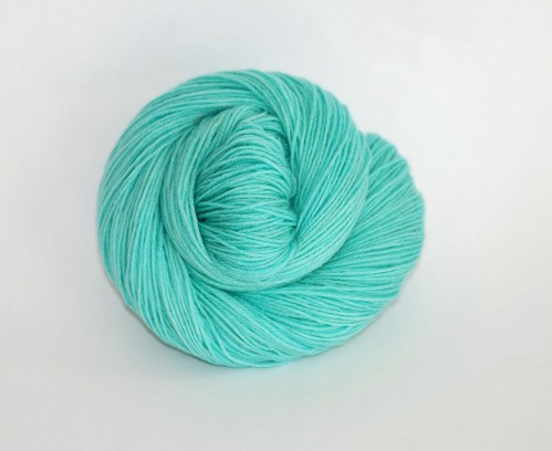
Seafoam is a tribute to two things: first, the Mediterranean ocean and its fabulous shades of turquoise, and second, my sister and her love of this colour! When we were young, our parents took us on the trip of a lifetime to Europe and one of the most memorable days was visiting the island of Crete. We found a beach where the most amazingly clear water rolled in from the turquoise sea and splashed up against a rock wall full of small caves once inhabited by hermits. My sister and I spent hours searching for shells and watching the waters. Ever since then this has been one of her favorite colours, so of course I had to dye it for her!
Dear Little Buttercup is a soft yet brilliant yellow that makes me think of the wee flowers found here in the meadows of the Rocky Mountains in summer. They’re not true buttercups, but as a child I certainly thought they had to be, since they are yellow and cup shaped. The name of the colour comes from a silly little song my mother would occasionally sing when we would find these flowers.
Roaring Twenties is a fabulous lilac grey straight out of the era for which it is named – the 1920s. Picture elegant ladies dressed in their fringed flapper dresses, partying until the sun rises in elaborate mansions with the gorgeous art and architecture of the era, and you have this colour!
Abstract is a colour inspired by my own personal interest in abstract art. As a younger person, I could never connect with this style of art, but it always evoked a response from me, which I think is often the best tribute an artist can ask for – to move someone! As I have aged, I have increasingly found more meaning in artwork that breaks free of the constraints of form, and I also like to play with abstract painting now myself. This is a colourway based on my favorite of my own little works, and expresses energy, passion, and a love of the basics of colour.
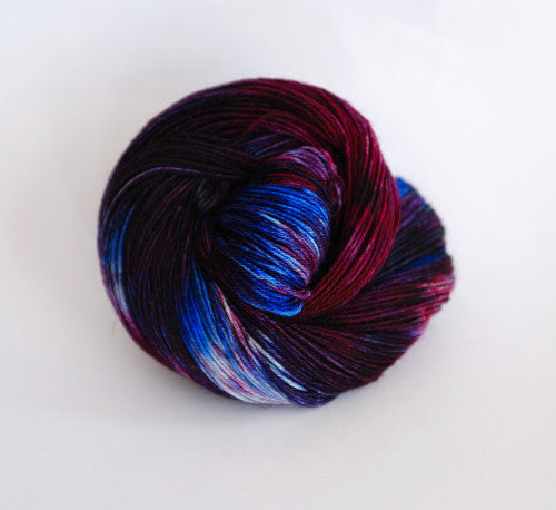
To Boldly Go is a statement about taking risks, having courage, and going out and just doing things! What kind of things? Why, anything that has meaning to you. I love the colour purple and this colourway includes it, but also deconstructs it into its bold and brilliant individual components. Just like life when you go out and live it, this colour is rich and bold and subtle all at the same time.
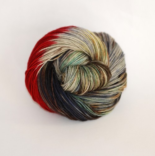
A Road Less Travelled is a very complex colour which was inspired by two things: first, a photo of a lone traveller walking along a road in Iceland; second, the person who asked me to do a colour based on this photo – our design coordinator Barb Brown. Barb is an amazing lady, full of contrasts, subtlety, and brilliance, with depths it takes time to discover. She has always gone her own way in life and has accomplished amazing things. This colour is my attempt to capture just a touch of Barb’s essence!
Raindrops and Roses is a new stippled colour that is full of nostalgia for me. While the song from The Sound of Music is part of the inspiration for this colour, there is still more that goes into this colour, such as rain drops running down car windows or the shattering of the colours of the landscape as you drive along. It is an alternate interpretation of the 2016 colour of the year for those who don’t like colour pooling yarns. It includes my favorite colours from traditional Icelandic sweaters. This is a relatively young knitting tradition, but it has a wonderful history well worth investigating!
Finally, for those who would like to know which colours finish out the Pantone spring/summer 2016 line-up, here are the current colours that also fit in this palette: Kitten Nose Pink, Tranquility and Swashbuckle or Frankly Scarlett! (the former is more orange, the latter more scarlet), in addition to those listed above, of course.

