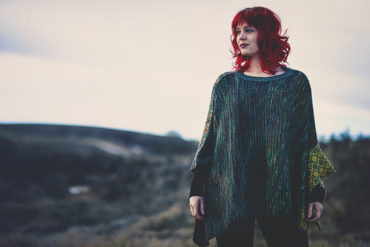
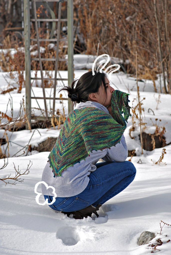
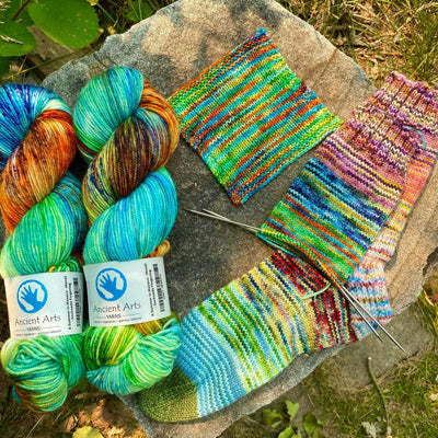
If you follow us on social media, I’m sure you’ve seen the release of the Wayward Wind Poncho by Julie Turjoman.

The Wayward Wind Poncho is the perfect layering piece for a crisp fall day, this poncho features subtle dimensional stitches that enhance the yarn’s richly variegated tones. The pattern sample is knit in 3 colours. 2 similar colours for the body, and a contrast for the mosaic detail; Frolic, Davy Jones Locker, and Goldmine
I know envisioning patterns in other colours can be difficult, so I thought I’d give a few suggestions and some tips on how to make your own colour choices.
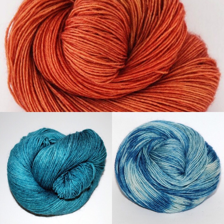
My first suggestion is Corfu, Forever in Blue Jeans, and Pumpkin Spice. The blues in Corfu go nicely with the variegation in Forever in Blue Jeans. I’m a huge fan of blue and orange, so I chose Pumpkin Spice for the mosaic detail. I love how bright and fun this combination is!
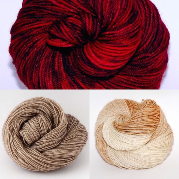
For this selection I wanted classy but with a touch of fun. The neutrals of Irish Linen and Himalayan Cat bring that classiness which goes well with the jewel tone of Syrah by Moonlight.

I’m a huge fan of red. It’s my favourite colour, and it can be hard to find a good contrast for red (green works, but most of us associate that with the Holiday Season!) Grey is a nice classy contrast, and I don’t care if it’s fall or not, I’ll wear red and grey year round! Here I have Syrah By Moonlight, Goth Chick, and Pieces of Eight.
Choosing colours for a project like this can be daunting. I find that using an app for my phone that puts colour pictures together can help. I use an Iphone, so my app is called Layout, but there are many apps out there for all types of phones.
Another good technique to use is to put a grayscale filter on your colour choices. Colour contrasts can be seen very well in grayscale. So you can choose a colour that does or does not contrast to suit your needs! Here is Syrah by Moonlight, Goth Chick, and Pieces of Eight again, but in grayscale.
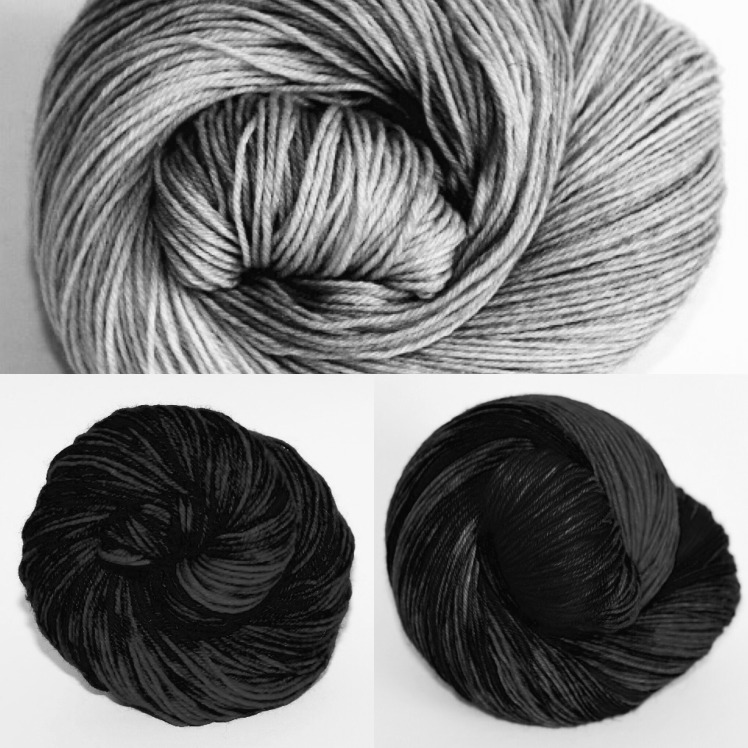 You can see that Syrah By Moonlight and Goth Chick don’t have much contrast between each other, but Pieces of Eight contrasts nicely with both.
If you’re feeling like you aren’t much of a tech person, you can always print out colour options and scrapbook them together! Get out there and have fun with your colours!

