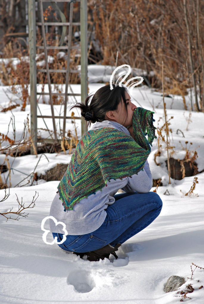


We are celebrating Ancient Arts Yarn being featured in the Stacked Stitch Wrap by Xandy Peters on the cover of Vogue Knitting! The lovely and talented Xandy Peters has been kind enough to guest blog a really fantastic article on colour theory.
We’ve also created Yarn Kits available in colour combinations selected by Xandy Peters, and Caroline Sommerfeld – our Master Dyer and Chief Yarn Officer!
Ancient Arts Yarn will be hosting a KAL for this beautiful pattern! Join us on Ravelry, Facebook, or simply post in the comments of this blog post. There will be lots of fun prizes, help, and support! The KAL starts today, July 21, 2016, and for the purposes of prizes ends November 21st, 2016. You can keep knitting along after that date!
Colour Theory with Xandy Peters
Recently I had the pleasure of meeting the staff of Ancient Arts Fibre Crafts and got to see their full range of yarns and colors. That same weekend, we all got our first look at the cover of Vogue Knitting Magazine with the purple and grey Stacked Stitch Wrap.
As dyers and designers we are lovers of color, unafraid to stray from the suggested colorways of a magazine, but for many knitters, color is intimidating. Many of you will choose to use the colors featured in the magazine and we all love that. There is, after all, a reason we picked those colors. But before you dive into your project, ask yourself if you’ve truly explored the color possibilities available to you.
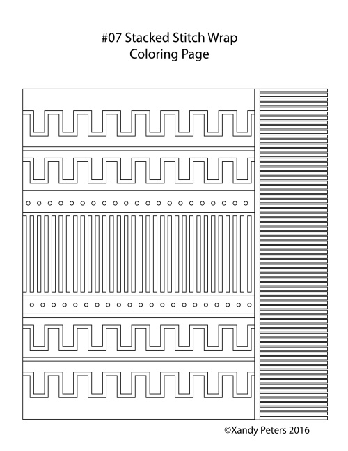
I love to learn from coloring (with markers and pencils, like a child) before committing to any particular set of hues so I have made a coloring page that you can print out and fill in any way you want.
When picking color there are many factors to consider, but only one rule: It can’t be wrong as long as you like it! That said, there are a few things to look for. Does the pattern work with solids or multi color yarns best, Will your FO match your wardrobe, and, most important, do you feel good in the colors you’ve picked.
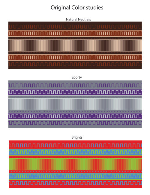
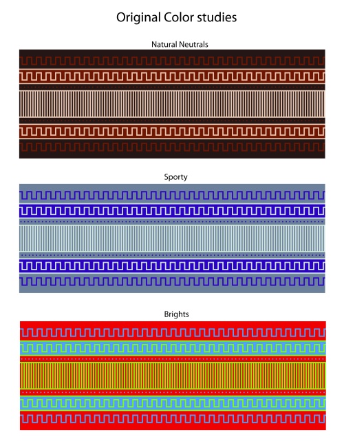
These are the 3 colorways that I suggested in the original pattern submission to Vogue Knitting, each one works in it’s own way.
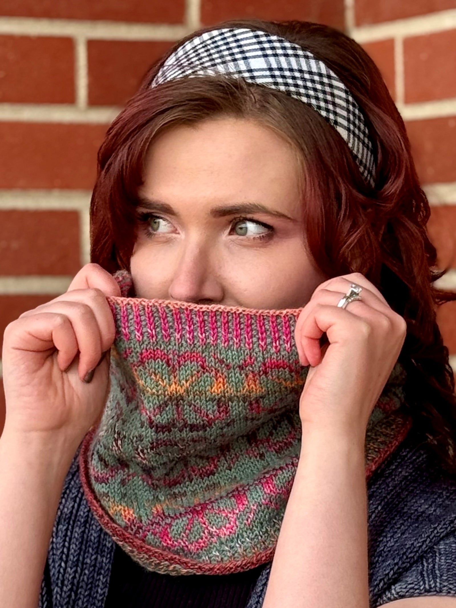
And within each group, there are many different ways to arrange the colors within the pattern. Here are a few examples of what the pattern looks like with the sample colors (Russian Blue, Pieces of Eight, and Amethyst) rearranged. Notice how simply switching the two contrast colors changes the overall feel of the wrap?
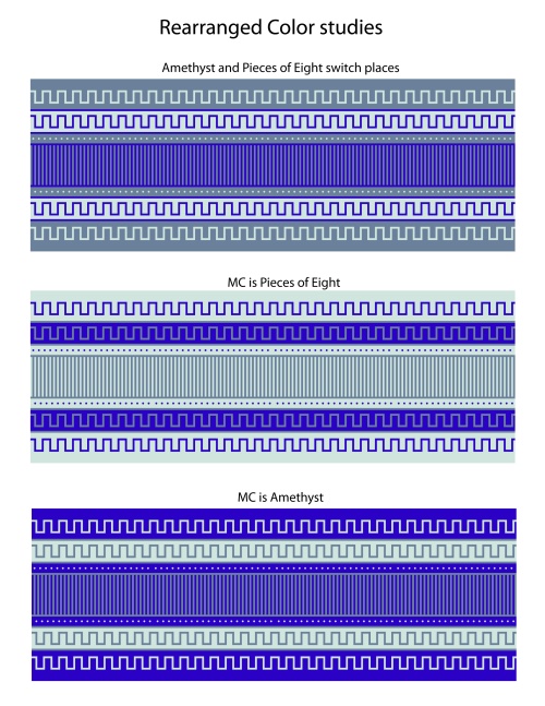
With these color tests, we can see that the light grey stands out against the two darker colors. We can use this contrast to draw attention to the center panel, or to draw the eye towards the edges of the pattern. When the light grey is the main color, the difference in tone between the Russian Blue and the Amethyst is slightly harder to see. If we switch up the main color and decide to use Amethyst in this place, there’s a lot more purple color happening in the wrap, but the purple color seems less special within the set of three. Sometimes the best way to highlight a color is to use the color sparingly to visually punctuate or “pop” the project.
But using a range of hues isn’t always necessary. If we look at the color options available within a monochromatic set of Ancient Arts Fibre denim tones, there’s still a lot to look at.
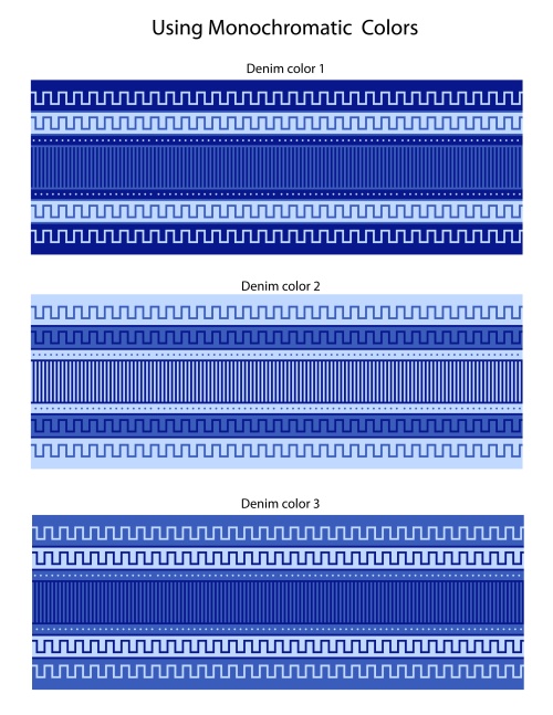
The biggest difference for me is that the blue tones remind me of bandanas, delft porcelain, and tea towels. The overall look of the project seems to show the personality of a different knitter. Maybe someone who would pair their wrap with a yellow sundress and some cowboy boots for a sweeter spring look.
With these examples in mind, I’d encourage you to print out a few coloring pages and have fun. The best part of picking colors is that it’s relatively low stakes when you’re working on paper. You can really explore and find the colors that you like before you commit to a set of colors.
To get inspired, see the full range of colors from Ancient Arts Fibre Crafts. Don’t forget to post your coloring pages and projects on Ravelry. We’ve started Stacked Stitch Wrap color-a-long thread where you can share and discuss your color picks.